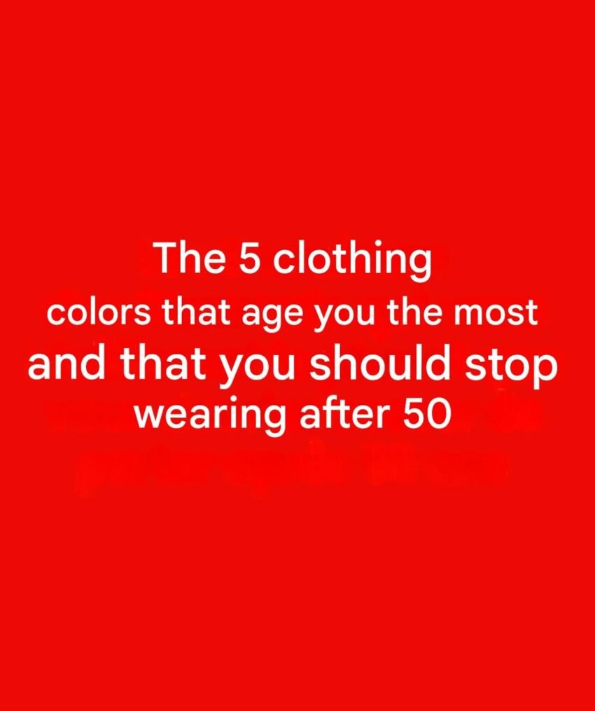
There’s no strict “ban list” after 50—but some colors can accentuate dullness, shadows, or uneven skin tone, which is what people usually want to avoid when aiming for a more youthful look. It’s less about age and more about contrast, undertone, and lighting near your face.
Here are the main ones to be careful with:
⚫ Harsh black (especially near the face)
Black can:
- Emphasize fine lines and shadows
- Make skin look more tired or sallow
Try instead: softer versions like charcoal, navy, or deep brown.
⚪ Stark white
Pure, bright white can feel too high-contrast and:
- Highlight discoloration or redness
- Wash out warmer skin tones
Try instead: cream, ivory, or soft off-white.
🟤 Muddy or dull earth tones
Think flat browns, olive-drab, or dusty mustard:
- Can make skin look lifeless
- Reduce natural glow
Try instead: richer, clearer tones like camel, rust, or warm olive.
🟣 Cool-toned pastels (for some skin tones)
Icy lavender, baby blue, or pale pink:
- May wash out complexion if you have warm undertones
Try instead: peach, coral, or warmer pinks.
🟡 Neon or overly bright shades
Very intense colors can:
- Draw attention to texture and lines
- Feel visually overwhelming
Try instead: saturated but balanced tones (teal, berry, emerald).
🎯 What actually makes you look more youthful
Instead of focusing only on what to avoid, prioritize:
- Contrast near your face (not too harsh, not too flat)
- Colors that match your undertone (warm vs cool)
- Healthy fabrics and fit (wrinkled or faded clothes age you more than color does)
✔️ Simple rule of thumb
If a color makes your:
- Skin look brighter
- Eyes stand out
- Face look more defined
…it’s working—regardless of age.
